Halaman

Black Magic

I would never have guessed that Ryan Korban's kitchen is painted in Benjamin Moore Chalkboard Paint. It looks fabulous and he can write himself a note to buy milk if he needs to. It's also inspired The Bachelorette to have her kitchen repainted in a darker color but I think we are going to go with Benjamin Moore Soot (2129-20) which is what Ruthie Sommers used in her kitchen below. It's also one shade down from Midnight Dream (2129-10) that was used on the front door of the apartment so it will coordinate perfectly. Now I just have to call the painter.

Read More

New Wave

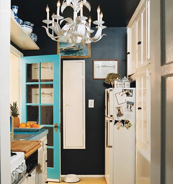
A reader asked the name of the fabric that Katie Ridder used on the back of the chairs above. It's called New Wave by Old World Weavers and the color is Capri (AB 0003 6512). It's available from Stark in New York but was out of stock today when I stopped by with my friend Eddie Ross. I was told that it's very popular and this is evident by the fact that Steven Gambrel also used it for the draperies in his new townhouse, below. It's a very beautiful fabric and I look forward to using it someday too. But first I have to wait for my sample to arrive!

Read More

Chic Design Office

When Laurie Reynolds and I get big enough to open our own offices, we can look to interior designer David Lawrence and his new studio space for inspiration. The first design office I worked in was on the 4th floor of a brownstone and was such a mess that we were embarrassed when clients accidentally walked upstairs. The next was better but no where near as good as David's new office. If I were a client and walked in and saw it, I would hire him on the spot! It's beautifully thought out and decorated and is the perfect backdrop for David and his team.

I thought the console looked like a Vladimir Kagan design and it is. If you aren't familiar with his work, you should definitely take a look at his website. Kagan has been designing for over 60 years and has a gorgeous range of furniture.

David has excellent taste in furniture as witnessed by this T.H. Robsjohn Gibbins chest of drawers in the entry.

Who wouldn't want to hang out in this beautiful room while waiting for a design meeting to begin?! I have always loved the Poul Kjærholm chairs that are around the back table. New chairs are available from Frtiz Hansen but David's are vintage. I always tell everyone that if you ever see the vintage versions for sale anywhere that you should snap them up immediately! The new versions just don't compare to the patina of the old leather.

This desk is also by Poul Kjærholm. The flowering branches remind me that I need to head to the Flower District soon!

The draperies can hid the office from the showroom space.

I am so jealous of the design library in David's studio! I wish I had a wall that large for all my magazines and design books!

Even the work stations are chic! I love the framed architectural drawings and little topiary.

David's office has a wonderful wall of windows and a Snowball light fixture by Poul Henningsen.

David's office has a large inspiration wall which any designer would covet!

He also has a little corner library and beautiful art in his office. From what I can see in the photos, it looks like a serene and spacious place to work and I look forward to seeing it in person soon where I will definitely be taking notes for the future! Thanks for the inspiration David!

Read More

Chic and Small

It's inspirational, if not aspirational, to look at the multi-million dollar projects of the top interior designers but sometimes it's fun to see how real people live. I mentioned that I was going to be featuring more original interiors and what better place to start than with some of the young designers behind the top designers. They manage to turn small spaces into chic and stylish homes without spending a lot of money. Something that many people are trying to do these days and the home of Laurie Reynolds, design assistant at Kate Ridder is chock full of great ideas!

Laurie grew up in Chicago ans studied Art History and Studio Art at Georgetown after which is earned an associates degree in interior design from Parsons in 2008. She started at Katie Ridder in August 2008 and while there was asked if she could draw and since she could, she was put to work on helping with the wallpaper line in addition to assisting with design projects. She said that, "seeing how Katie combines unexpected elements and colors has really taught me a lot about pushing through the boundaries of predictable design."

In the photo above, Laure created a dramatic grid of butterfly prints that were actually taken from a calendar bought for half off last year and hung in frames bought on sale for a steal at A.I. Friedman. We've seen this done before with plates taken from the Cabinet of Natural Curiosities but it could be achieved just inexpensively with a book found at a flea market or even photographs.

Her bedroom is proof positive that recent graduates don't have to sleep on a futon and live with milk crates. The room is completely pulled together and well thought out. Her window treatments consist of not only bamboo blinds but curtains as well. Pear River Mart in New York is a great source for many different styles of inexpensive blinds that look great. The paintings were from her senior project in college and rival those of many New York artists! You could also create your own paintings or stretch your favorite fabric over a canvas and hang it as well.

The filing cabinets were painted bright turquoise and remind me of a Katie Ridder color. She then topped them with a piece of MDF that she had cut at Home Depot and painted high gloss black. You can't make it out in the photo but the edges are painted gold. You could achieve a similar look by painting an old wooden desk a bright color and having a piece of glass cut to fit the top. The desk chair was bought on sale at TJ Maxx but was an unfortunate cherry wood color so she painted that black too.

She even dressed up the dresser from Ikea with new knobs from Lowes. Before working at Katie Ridder, Laurie was an intern at Fawn Galli Interiors, in the West Village and also for a florist every summer during college. "We did a lot of big parties, setting up large rooms for events, and I had a really amazing boss there that very much inspired my design sensibility," she says.

Laurie says she loved interior design since she was a kid. "I used to draw floor plans of my future dream houses and spend hours rearranging the furniture in my doll house. I think what I love most about interior design is how you can influence the way a space makes you feel."

"My advice for someone that wants to go into design is to first work hard and get all the basics down. You have to know how to exactly order a pillow and where a curtain rod should be placed on a wall in order to simply function in the industry. And of course, most importantly, trust your instincts. If you think it looks good, it looks good."

I think Laurie's apartment looks better than good! It really is a great example of how great style can be achieved without spending a lot of money. I would remember the name Laurie Reynolds because she's definitely got what it takes to have her own fabulous design firm someday!
Read More

Como mejorar las relaciones de pareja con la distribución interior de la casa

En la última década, la distribución interior de la casa ha sufrido una notable transformación hacia la comodidad, la intimidad, la privacidad… pero también hacia el fomento de las relaciones sociales, las reuniones familiares y la vida en común.

Por esa razón proliferan los espacios diáfanos, abiertos, las estancias comunicadas y dinámicas.

Todo esto ha traído consigo muchas cosas. Lo primero que ha conseguido es evitar la pérdida de metros que se destinaban a los pasillos, recibidores y halls en los espacios pequeños. Hoy en día es habitual encontrarnos en mitad del salón al cruzar el umbral de la puerta, un salón que además es comedor y en cuyo centro se sitúa la cocina. Las habitaciones están separadas de esta amplia estancia conformando la zona privada o nocturna.

Es una distribución que está a caballo entre la tradicional y el loft, a quien todavía le queda mucho camino por recorrer. Pero he aquí el problema, y es que a mayor número de opciones, mayor número de discusiones.

A la hora de decidir el tipo de distribución que tendrá nuestra casa, es fundamental pensar en el modelo de vida que nos ha tocado vivir, para buscar el equilibrio entre la distribución que mejor se adapta a nosotros y a la forma geométrica de la vivienda.

Debemos pensar si tenemos o tendremos familia, si nuestros horarios de trabajo nos permitirán mayor o menor número de horas de ocio, si nuestras horas de ocio coincidirán con las de nuestra pareja… pero también en que seguramente a nuestra casa no le sobrarán los metros, y debemos tener en cuenta si es de planta cuadrada, rectangular, desigual…

La vida que nos ha tocado vivir a los treinta añeros nos facilita muchísimo las discusiones, las broncas infundadas y el mosqueo al por mayor. Y por qué? Pues porque vivimos al segundo y no nos queda mucho tiempo libre para ocuparnos de nosotros mismos.

Esto hace que al llegar a casa cada uno se adentre en su espacio para ocuparse de sus cosas, olvidándose en ocasiones de quien repasa facturas en la habitación de al lado. Durante el día no nos hemos visto… y ahora tampoco. La comunicación se reduce al hola inicial y al beso de buenas noches.

Los espacios abiertos, nos permiten desarrollar en ellos muchas actividades de distinta envergadura, al mismo tiempo. De manera que cada uno podamos estar con un ojo en nuestro trabajo, y el otro en la otra parte contratante. La comunicación será más fluida y más dinámica. En resumidas cuentas, existirá.

Esta fusión de estancias hace que nuestra casa crezca, y que este espacio de día sea más cómo y versátil. Tendremos mucho más espacio cuando nuestros amigos vengan a nuestra casa a jugar al trivial, o cuando tenga lugar en ella una comida de celebración. Una vez acabada, la tertulia se trasladará al salón, pero quien se responsabilice de recoger la mesa, también participará en la conversación, en lugar de quedarse “aislado en el fregado”.
Fuente: DecoEstilo
Read More

Hometown Love!

I want to thank Mackenzie Carpenter of the Pittsburgh Post-Gazette for including me in her story on design blogs today! It was a real honor and treat to be featured in my hometown newspaper (well, almost hometown)! I've already sent my father out for multiple copies! And a big thank you also goes to her sister Mary Chapin Carpenter who turned her on to my blog!

Part of my plan for the new year is to post more original content and to profile interesting and creative people who aren't yet on everyone's radar. I have been running around the last few days so I wasn't able to post one of the newest today so check back on Wednesday to be introduced to an up and coming interior designer!
Read More

I Heart Grant K. Gibson!

I'm so glad I posted about Fabrice Diomand recently because it led Grant K. Gibson to contact to tell me that he had been to Fabrice's shop and it's been love at first email ever since! Grant is not only the sweetest designer I've ever met (well, via the internet) but also fabulously talented! He began his design career in New York and worked for a few top designers before moving to San Francisco and going out on his own in 2002. His big break came when he designed a "Gentleman's Retreat" in the 2004 San Francisco Designer Showhouse and he's been on a roll ever since!

I've enjoyed not only checking out his portfolio online but also his blog! It was originally created to share his travel escapades with friends and I'm so glad he kept up with it! His travel photos are top notch (some are posted below) and his adventures in Paris are enviable! I love the story of him running after Charlotte Moss! But the best part are is sneak peeks into the homes of Suzanne Reinstein, Michael Smith and Windsor Smith! I really wish Grant lived in NYC but since he doesn't, I will continue bonding with him over Gossip Girl and Diet Coke via email. But I hear he may be planning a visit soon so this story may be continued! Enjoy!


Read More

My New Butler's Pantry - Before and After!

When I moved into my 1930's Royal Barry Wills Colonial four years ago I was certain the room the real estate listing indicated as "small office off kitchen" would someday turn back into the Butler's Pantry it was originally intended to be. The room measures 9' X 8', and because of the way the lot is graded it has 9 foot ceilings and a lovely, large window. Over the years the previous owners removed the original cabinetry and moldings.
As you can guess, I had grand visions (and a limited budget)!
I wanted it to be an office and a real working pantry -storage for platters, serving pieces, my mixer, and a place to roll pastry crust. I wanted to hide away my microwave, have filtered hot and cold water. We needed file cabinets for family organization and a place for the family computer and hard drive. I wanted to be able to sit in this Pantry/Office and blog. I wanted to showcase my mothers heirloom, turn of the century China. And, I insisted that it look original to the house but with an updated feel. 
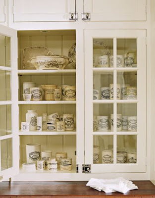
Here is an inspiration photo of the glass front cabinets. I also wanted honed marble counters for rolling pastry. Because my kitchen cabinets were white I wanted the pantry to cabinets to be different, but not wood, so I wanted a gray/green color.

Cote de Texas
Here is my inspiration photo for the color of the cabinets. Many of you may recognize this kitchen, it is Sally Wheat's Kitchen from Cote De Texas "Stalking the Wheat's" post. Joni was kind of enough to put me touch with Sally who shared her color with me. Do not miss touring Sally's house. It is incredible - she has wonderful taste and talent! Here the link.
After four months of searching I finally found my marble. Here is my slab of Calcutta before it was installed.
I wanted period style hardware. I loved these from Christopher Peacock. I ended up finding a nearly exact replica from Cliffside Industries. Lucky find! Vertex
As a family, we drink gallons of bottled water. At my husband's urging we found this bottleless water filtration system from Vertex. It heats and cools the water and connects directly to a water line. No more lugging bottles or polluting the landfills and the kids make their own hot cocoa and cup a soup instantly.
I found a wonderful cabinetmaker who was able to work with in my budget constraints. We had some mishaps with other subs, but were able to hide/fix the problems, so hopefully you can't notice them.

Here is the before:
And After: The Butler's Pantry! The cabinets go all the way to ceiling and the molding wraps around the room. Walls are real wood tongue in groove beadboard. You can't see that the counters are honed, nor can you see the bevels on the glass. The color is more gray than green and the counters have much more contrast than these pictures show. The microwave is hidden in the the cabinet in the bottom left of the photo. Drawers have platter and serving pieces. The appliance garage on the left holds my Kitchen Aid mixer & Cuisinart. It's still too new, so I haven't rolled out pie crust yet -but I will in time.

This side is my office area. Cabinets house file drawers and the hard drive. The appliance garage on the right has shelves for bills. The cabinet on the bottom right of the photo has a drawer for each family member - this is a handy place for keeping homework and school things organized. The far right is the bottleless water cooler - we love it!
So if you ever wondered where I am when I am blogging - here it is! I think I accomplished all I had hoped. My husband calls it my little jewel box - and really it is! Hope you like it!
Read More
DISCLAIMER
If you are the copyright owner of any of these articles or image and don't want me to share them, please, write comments on pages and I will gladly remove them.