Halaman

Edith Bouvier Beale Book

I'm really surprised that in all the coverage of Grey Gardens recently, I don't remember hearing about Edith Bouvier Beale of Grey Gardens: A Life in Pictures. After Edie's death, her niece Eva Marie Beale compiled family photographs, poetry, letters, sketches and more for the only family sponsored book. It was "conceived a with a deep dedication, understanding, and personal connection" mostly in an attempt to introduce the world the beauty of Edie's early gilded life instead of just the later squalor. With a foreword by Peter Beard and beautiful photos, I too think I would rather remember Edith Bouvier Beale in this manner and look forward to ordering this loving tribute.
Read More

Bon Weekend!

It's the weekend and you know what that means...lots of fun summer activities. I'm not sure if it's going to be a good beach weekend but if you happen to be out in the Hamptons, you should definitely try to attend Matt Albiani's book signing event for Lifeguard on Duty at T.B.D., a fab new men's store in Southampton (67a Jobs Lane) on Saturday, July 25th from 5:00-8:00pm. They carry Unis and Save Khaki, lines so cool I've never even heard of them! If you're a guy, you can pick up some clothes and a buy book. If you are a girl, you can buy a book and pick up a guy! And you both can buy a photograph from the book since they will also be up for sale. I can't guarantee any lifeguards will be there but since it's on dry land there's no way you can fake drowning for the mouth to mouth anyway.

If you're planning a staycation in the city, I highly recommend the Frank Lloyd Wright exhibition From Within Outward at the Guggenheim Museum. It's the 50th anniversary of the Guggenheim and what better way to celebrate that with an exhibit dedicated to it's architect. I attended a preview before it opened and really enjoyed seeing all the beautiful hand renderings and newly created three dimensional models of his designs including some that were actually built and others that never saw the light of day. I grew up close to Fallingwater so when I think of Wright, I picture his more linear buildings but toward the end of his career, his designs became more cylindrical. One that was never built looked like a spaceship that had just landed a top a hill! I think kids would really enjoy this show too...just make sure they don't touch anything! They break it, you bought it!

After the museum, you can head down to 54th Street for drinks and dinner at the newly renovated Monkey Bar. Unlike Graydon Carter's uber-exclusive Waverly Inn, the Monkey Bar actually has a listed phone number. Whether they actually pick up is another story but you probably have a better chance of getting in while all the beautiful people are in the Hamptons. Of course, that means you might be there with all the un-beautiful people but it's worth it for the fries. Just hope they didn't change those!


What could be better than dinner and a movie?! I have been hearing good things about The Ugly Truth and might have to take in a showing this weekend. I could use a little help in the dating department and besides that, Gerard Butler's not too bad to look at either. Nuff said.

After you've gorged yourself on popcorn and Jujubes at the movies, you may be need of a workout and I am excited to announce that Physique 57 is now selling DVD versions of their famous workouts! Kelly Ripa is a devotee and you've seen her arms. They give Michelle Obama's a run for their money so you know it's gotta be good. After Physique 57, you'll be ready for the beach! Bon Weekend!
Read More

A Visit with Covetable Designs

I feel so lucky to be able to meet such wonderful people through Willow Decor. Just the other night I received a sweet email from a fellow blogger, Kristin at Covetable Designs. She had been overwhelming busy, she said, and tonight she finally had some free time to relax and catch up on reading my previous blog posts. I was so flattered. We started emailing back and forth and it turned into a great treat for me, as I learned so much more about this talented designer! We had so much in common, both having lived in Europe for several years and traveling around; both with a passion for renovation and both self taught designers. I am just in awe of her abilities, so I wanted to share a few images of her home, which she designed, in Dallas.
The above photo is a French dairy turned restaurant that Kristin visited and one of many inspiration photos she used to help design her kitchen. After living several years in London, she was influenced by how her friends lived there.
"They did not view their historic homes as museums, slavish to all the detail of the period. Rather, they used contemporary furniture and accessories to lighten up and streamline their homes. The juxtaposition was thought provoking to an American who was taught to respect period decor, restore old homes, and preserve vintage architectural detail at all costs. And I couldn't really find a designer here who was exactly on my same page. So, I took the lessons of lightening and streamlining to my new home. I wanted architectural detail that was European in feel, without being constrained to any one period or style and I designed the interiors with an eye toward creating a particular mood in each space. The element that ties them all together is the use of neutrals as a backdrop, allowing the colors in fabric and furnishings to glow or in some cases, pop. "
Above is Kristin's new kitchen. Do not be fooled, this is not a renovation of an old home, but a meticulously designed new home with all the elements of an antique. I love the zinc counter and the metal hood, painted to look like aged zinc. Of course I adore the X cross motif which she incorporated in many areas of the design. The Marston Langinger lantern is perfect!
What I find most impressive is the window design over the sink. Kristin boldly painted that area in dark gray and the results are stunning.
A close up of the stove area reveals that she used an antique French fireback as a focal point. The herringbone patterned limestone and the sconces add to the aged French feeling.
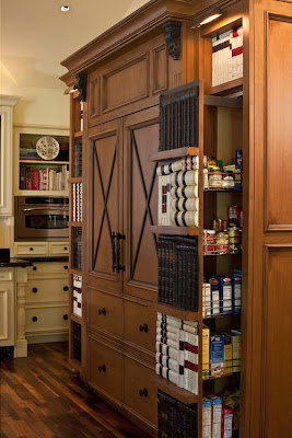
We see the X cross motif translated again on the refrigerator. The pantry pull outs are faced in old books. Very clever.
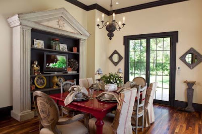
The breakfast room is a delight! Notice the mix of chairs. Some are upholstered in old German printed grain sacks, while others are slipcovered in striped sacks. Visit her blog to see how she transformed the wooden table and chairs. The zinc elements tie the room in well with the kitchen. Again Kristen takes a bold chance with the red table, a viola, it pays off. The fabulous bookshelf was a exciting find at Mecox Gardens.
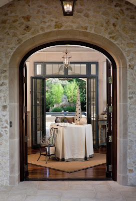
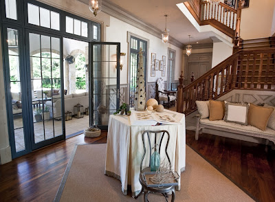
Here is the beautiful entryway.
It is crafted so well its hard to remember this is new construction. Notice the wood banister and wainscoting.
Here is a closer image of the wainscoting. Isn't this wonderful design? The glazing/painting technique really adds a wonderful patina to the space.
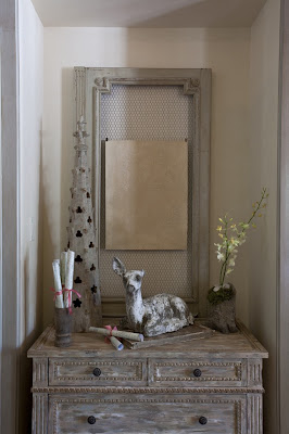
The other wall of the entry has these two wonderful Aidan Gray chests flanking the niches in either side. The wonderful old doors behind the chests were from the bookcase above. Beautiful!!
I have read every one of Kristin's posts and marked several in favorites folder. I am so excited to see more of her work in the coming months. Do check out Covetable Designs, and when you do, tell Kristin that Gina from Willow Decor sent you!!
.
Go see Julia at Hooked on Houses to see what others are Hooked on!
.
~Never miss a post - Subscribe to Willow Decor in the upper right corner~
Read More

Diseños Decoracion de las Arquitectas Dos propuestas de las arquitectas Giuseppina y Carla Cánepa

Aquí encontré mas diseños de las arquitectas Giuseppina y Carla Cánepa.
Dos propuestas de las arquitectas Giuseppina y Carla Cánepa, especializadas en diseño de interiores, han reunido en su tienda Arq Studio varios modelos. Una es “Cocina Luce!” de Effeti, del diseñador italiano Giancarlo Vegni, cuya disposición en T es muy sencilla y funcional.


La otra propuesta es la ”Veneta Cucine”, una cocina-living Extra-Fashion. Tiene forma de U y el área de cocinar y disfrutar cuenta con la cocina italiana Smeg coronada por dos campanas cilíndricas Faber del grupo Franke.


Enlace: caretas.com.pe
Read More

Diseños Decoracion de la Arquitecta Giuseppina Cánepa

Buscando en internet más diseños y modelos de terrazas, encontré a la arquitecta y decoradora Giuseppina Cánepa que através de las publicaciones que hizo la revista caretas.
En este diseño de terraza Giuseppina Cánepa muestra la simplicidad y de hecho que ha logrado plasmar en la terraza de su casa, una decoración que complementa muy bien con el diseño arquitectónico pleno de linealidad y simplicidad.
Predominan los tonos celeste, turquesa, marrón y gris acero. En este ámbito se disponen la piscina y el jacuzzi temperado para el relax, pero además elementos para reuniones familiares, como zona de parrillas, horno serrano y kitchenette.
El material predominante es el porcelanato y para protegerse de las inclemencias del sol, la garúa y el viento, ella ha diseñado un toldo con forma de vela de embarcación, que combina muy bien con el mobiliario italiano, los adornos de mimbre y los confortables sofás. Junto a la piscina, un jardín con palmeras y papiros, el verde del grass y una vista maravillosa de la ciudad.


Enlace: caretas.com.pe
Read More

Off the Beaten Path in Paris

A few of you had some great shoe suggestions for Paris that I had never heard of so I thought I should ask if anyone has any off the beaten path restaurants or shops we should visit. Obviously we plan to visit all the sites and other usual suspects such as Deyrolle, Colette, R & Y Augustie, les puces, Laduree and Pierre Herme, etc. I keep joking with Stefan that I am going to have to taste test every macaroon in Paris. Good thing we'll be walking them off! But if anyone has any secret gems, we'd love to hear them!

We didn't announce it before but we will also be attending the Maison & Objet home show while in Paris. When I was talking to Monelle Totah from Williams-Sonoma Home and telling her our plan to visit Versailles, she was the one who suggested that we visit in September so we go to the show. I hear it's amazing so we are also very excited because it means that many of our friends will be there too such as, Mercedes and Alberto from Etos and George and Jon from Flair! I can't think of any more fabulous people to share our trip with and I know it will mean lots of fun stories to report later!

We are staying in the Saint Germain area a block away from the Seine and the Pont Neuf which couldn't be any better for walking to all the sites. Everyday I wish I was leaving tomorrow! But I'm sure you are sick of me talking about Paris everyday so I promise to post about some other topics...for a few days at least! A bientot!

Photo from GoosieGoose via Flickr
Read More

DECORACION DE INTERIORES DE LA ARQUITECTA KARIM CHAMAN - DECORACION DE SALA-COMEDOR POR KARIM CHAMAN

De esta forma quiero compartir los diseños y decoración de interiores de la arquitecta Karim Chaman, que encontre en las publicaciones de la revista caretas.
Karim Chaman siempre muy elegante y soñadora al momento de decorar sus ambientes.
Esta vez la propuesta de la arquitecta en los colores "blanco y negro", parte de concebir la casa como un espacio artístico y mágico, pero confortable y elegante al mismo tiempo.
decoracion-comedor-principal-karim-chaman
Para transmitir elegancia en la decoración de este comedor, Karim Chaman utilizó en las paredes un panel de mármol Calacatta traslúcido, a manera de damero, es también una instalación artística conceptual sostenido por una estructura de fierro, el cual está adosado en la sala a manera de una obra de arte.
diseno-decoracion-sala-moderna-karim-chaman
Para la decoración de esta preciosa sala, la arquitecta y diseñadora de interiores Karim Chaman; usó los muebles estilo pop de Verner Panton, se complementan con las alfombras de alpaca y la cristalería fina de Lalique y Baccarat.
decoracion-sala-comedor-karim-chaman
decoracion-diseno-sala-moderna-karim-chaman
Fuente: caretas.com.pe
Read More

DISENOS DECORACION DE INTERIORES ARQUITECTAS PAULA VECCO Y CARLA CHAVEZ

Me parece muy elegante la combinación de colores en el diseño y decoracion para la terraza. Estos diseños y decoración de interiores de las arquitectas Paula Vecco y Carla Chávez (publicadas en la revista caretas).
Para diseñar y decorar la terraza, las arquitectas (Paula Vecco y Carla Chávez) decidieron por los colores nogal y blanco con acentos en color limón, enmarcados en una divertida alfombra de pelo de llama, ideal para zonas de alto tránsito
Asimismo este ambiente principal también congrega sala, comedor y bar. Destaca entre los tonos tierra y los acentos lacres la alfombra de lana y oveja de forma cuadrangular, que delimita acertadamente el espacio que pertenece a la sala. Para evitar que se mezclen las áreas interiores y las exteriores se colocaron cortinas, logrando independencia en cada decorado.

Fuente: caretas.com.pe
Read More

Spectacular Pool Houses!

Finally some sun is peeking out from the behind the clouds in Boston and it makes me want to grab my sunglasses and head out to the pool. What better place to recharge than in one of these lovely pool houses designed by our talented friends at Catalano Architects.
This is a beautiful pool house on the grounds of a spectacular home in Barnstable on Cape Cod. I love the roof lines of the building. It really shows off the traditional cedar shake roof shingles The inside of the pool house is perfectly outfitted for guests with a mini kitchen
and family room area. Notice off to the left a staircase to a second level and to the right what looks like a pantry/towel room.
It also houses a wonderful bunk room. This picture may be familiar to many of you as I have shown it before in my post on Built in Beds. This particular bunk is one of my favorites! To view even more photos of the Barnstable main house and interiors click here.

Our next spectacular pool house is only a short drive west of Boston.

Unfortunately, this pool house was not open yet for the season but you can still see the wonderful architecture and design of what clearly is a fabulous pool area. The "great" room is in the center and two smaller rooms flank either side. Notice the cupola and window.

Here is the view of the "great"room. The ceiling is an amazing work of art. Notice the large lantern hanging inside the cupola. You can almost see how wonderful the light plays in this space.


Another angle of the great room which includes a full kitchen, center island seating, dining area and family room space.

Here is one of the rooms flanking the "great" room. I love the use of stone on the interior walls and it is a nice contrast to the "great" room which is predominately wood.
To view more photos of the main house and interiors click here.

Thanks again to Catalano Architects for giving us a private look into these incredible properties. Check out their website for more of their inspiring work!
Read More

Chic and Comfortable

I want to thank everyone who emailed me and left comments today! I really appreciate your support! I've been running around all day and am too exhausted to write a big post tonight so check back tomorrow for our regularly scheduled programming!

On a side note, one of my readers was worried that I would wear white sneakers popular with American tourists while I was in Paris. Don't worry, HC will not embarrass you or herself while abroad. I already have all my chic shoes picked out for my trip including this fabulous pair of Hogan Interactive Sneakers that will only be worn to tour Versailles. And maybe if it rains or my feet really hurt but it would take a lot for me to give up wearing my Christian Louboutins in Paris. It's like they are going to the motherland!
Read More

House Beautiful Kitchen of the Year

House Beautiful was sweet enough to invite me to the launch party for their Kitchen of the Year with the Barefoot Contessa, Ina Garten, at Rockefeller Center Monday night. The kitchen was designed by Robert Stilin and will definitely be placed in my file for my future home design reference. It's the absolute perfect kitchen for cooking and gathering. It will be on display until Friday, July 24th and there will be lots of cooking demonstrations and tastings to attend if you are in town. (To see the schedule of events, click here.) If you're not in New York, you can see some of the photos here and also on the House Beautiful website.

Here is the Barefoot Contessa herself, Ina Garten, with the editor of House Beautiful Stephen Drucker. She was super busy but was gracious enough to pose for a few photos and chat with me for a second. Of course, I had to compliment her on her fabulous necklace which she said was an anniversary present from her husband, the famous Jeffrey. She also suggested that I read her book, Barefoot in Paris, before my trip for ideas on where to go while in Paris.

Ina and Jeffrey were just as sweet and adorable together as they are on her television show!

One of the best parts of the attending the event was picking up the gift bag on the way out. I mean if you're going to break your diet for anything, I mean it might as well be for the Barefoot Contessa sour cream coffee cake! I cannot wait to make it! And I will proudly wear my new apron and use my new spatula while doing so! A big thanks to everyone at House Beautiful for allowing me to be apart of their evening!


Photos by Heather Clawson and Julian Wass for House Beautiful
Read More

Plagarism is Not Chic

Much of the time, bloggers write about the same people, magazine articles or events. We often use the same photos and source materials. It's usually no big deal if someone writes a similar post about a similar topic. But when another blogger copies word for word what you have written, that steps over the line into plagiarism. I normally like to stay away from negativity on my blog but I was so shocked at what I found today that I feel I have to address it publicly.

This past March 16th, I spent hours working on a post about the Perfect Paris Penthouse of Giancarlo Giammetti. I looked everywhere for the right photos that would showcase the apartment. I knew I had seen it featured in an old Town & Country magazine and was able to find it on Peter Marino's website. I also pulled out my copy of the Vogue Living book. I knew the late Fernando Bengoechea took the photos so I pulled a few from his website. I spent hours writing the story and making sure that I properly credited Peter Marino for his quotes. And of course, I also added my two cents about how much I loved the apartment and it's design. I actually stayed up late that night to put it all together.

So when I noticed that another interior designer and blogger had also written about Giancarlo's apartment today, I took a look at her post. (She has since taken it down.) I was interested to read her take on it. What I wasn't prepared to find was that she had copied most of my text or changed it very little. At the end, she had credited seven sources, none of which were my blog. I understand the similarities where we have quoted Peter Marino but she has blatantly copied parts that I wrote such as "Giancarlo Giammetti is the business brains counterpart to Valentino's creative genius." Also, where I said that "evidence that no detail was overlooked or no expense was spared!" Those were my words not a phrase that came out of any of the articles or books. And "what I love about the apartment was even though it was completed in 1977, it doesn't look dated at all." She took all of these for her post and more.

I emailed this blogger earlier and copied a few other bloggers on it as witnesses. I told her that she could either change it, remove it or credit me. She took it down finally but I still have received no reply. I decided to post this also as a warning to other bloggers. People will notice if you copy someone else but not only that, it takes all the fun out of blogging. Everyone should have their own voice and opinion. It's part of the reason that I try to post original content or to make sure I credit my source of inspiration. I hope everyone will try to do the same going forward.
Read More

Another Peek in to Linda Banks Home

As promised here is another peek into Linda Banks' new home in Maine. She has wonderfully transformed a 1960's ranch into beautiful "loft meets barn" home.
Looking from the kitchen into the living area we see Linda continues her very neutral palette.
This room also boasts the high ceilings painted in a pale blue.
Wonderful bookcases anchor this room. I especially like the interesting lighting above them.
Architectural details abound. Notice the way Linda made the doorways higher than traditional doorways and beefed up the depth of the entry and exits. These things bring a weight and added interest into the room. I adore this table - It has a more delicate apron than the cabinets but I like how she tried to repeat this feature in the living room. Again her love of antique signs is evident - although the sign above is not an antique and available for sale at her shop, Simply Home.

Here is a wonderful shot of the exterior custom milled french doors. You know I am a lover of the X cross tops! Notice the height of these doors as well.


Here is a view of the exterior of the house.

And a close up of the doors from the outside. Linda added the stone faced exterior. The zinc planters are the perfect scale and size.
Here is a view of the living area from the loft/office space above.

Here we are back in the breakfast area/keeping room looking toward the family room and the stairs to loft/office above.
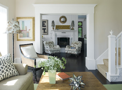
In the family room looking out toward the keeping room. This neutral room is accented in wonderful, fresh green.

Legumes sign, woven chairs, aged coffee table, an architectural fragment of a column in corner all add texture and visual interest.


I love how Linda placed the antique dressmakers mannequin in the corner.
Lets head upstairs to the loft/office/studio.
Here is an interesting transition in the rooms above.
And here it is from a different angle.
Here is the office area - The pear chairs are very interesting. Also notice the hanging lantern and built in drawers in the dormer. The Guest bedroom is very cozy. This is the only room we see any window treatments at all. Horizontal boards lend an interesting change to the vertical beadboard in the other parts of the house.
A lovely vignette! A wonderful bath - notice that again wall boards are hung on the horizontal. The mirror is an antique from Linda's personal collection.
Beautiful mouldings and star hooks add charm to the Mudroom. Also notice what I think is an interior window - it brings in great light and a feeling of spaciousness.
Finally, another view of the Living Room - The interesting dragonfly mirror is a custom design by Banks and available for sale or by mail via her wonderful shop, Simply Home. Read more about the building and design process in Maine Home and Design.
Thank you Linda, for the wonderful tour of your beautiful new home!
Subscribe to Willow Decor and never miss a post.

Read More
DISCLAIMER
If you are the copyright owner of any of these articles or image and don't want me to share them, please, write comments on pages and I will gladly remove them.